Introduction

In the dynamic world of business, a brand’s logo is more than just a visual

representation—it’s a powerful
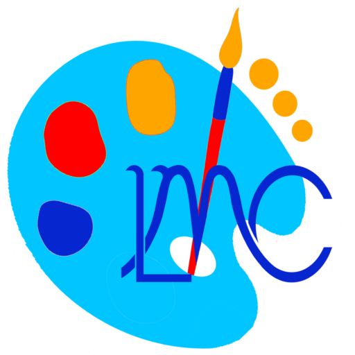
statement that encapsulates the essence of the company. Leomike
Creativity, founded by Leo Michael Saviour Amedodzi, recently transformed, and its new logo is a testament to creativity, passion, and
purpose. Let’s delve into the symbolism behind this revamped emblem and explore the colors that breathe life into
it.
The Symbol: LMC
The heart of Leomike Creativity’s logo lies in the elegant fusion of letters: L, M, and C. These initials stand for the brand’s very name—Leomike Creativity. But they also represent more than mere words; they embody the spirit of innovation, originality, and artistic flair. Just as an artist wields a brush to create a masterpiece, Leomike Creativity wields its tools to craft digital wonders.
The Paint Palette: A Canvas of Imagination

Why a paint palette? Imagine an artist standing before a blank canvas, poised to transform it into something extraordinary. The paint palette, with its vibrant hues and mixing wells, is the artist’s gateway to creativity. Leomike Creativity, like an artist, blends colors, ideas, and technology to weave captivating narratives. The palette symbolizes the boundless potential within every project—the ability to turn imagination into reality.
The Colors: A Symphony of Meanings
1. Blue: Trust, Freedom, and Wisdom
Blue, the color of the sky and the sea, evokes a sense of openness and expansiveness. It whispers of freedom, intuition, and inspiration. For Leomike Creativity, blue signifies trust—the trust clients place in their expertise. It embodies loyalty, sincerity, and depth—the very qualities that underpin lasting relationships. As the sky stretches limitlessly, so does Leomike Creativity’s commitment to innovation and excellence.
2. Red: Passion and Energy
Red, fiery, and intense, pulses with energy. It’s the heartbeat of Leomike Creativity—the passion that fuels every project. Red ignites creativity, propelling the team forward. It’s the spark that transforms ideas into impactful designs. Just as an artist’s brush strokes breathe life into a canvas, Leomike Creativity infuses its work with the same zeal.
3. Orange: Optimism and Warmth
Orange, a harmonious blend of red and yellow, radiates warmth and enthusiasm. It’s the dawn of a new day, the promise of possibilities. Leomike Creativity embraces orange as a beacon of optimism—a reminder that challenges are disguised opportunities. With every project, they infuse warmth and positivity, leaving a lasting impression.
Conclusion
Leomike Creativity’s redesigned logo isn’t just an image; it’s a manifesto. It speaks of trust, passion, and optimism—the very qualities that define their journey. As the paint palette mixes colors, Leomike Creativity blends creativity, technology, and heart. So, next time you see that elegant LMC, remember that behind it lies a world of imagination waiting to unfold.
See also https://leomikecreativity.com/why-its-so-important-to-have-an-impactful-website-design/


